Appearances matter. Your banner image, your spacers, logos–they all communicate things to people. Ensure you consult this list and understand how to use the best non-system fonts on your website.
When we launched Edgy Labs, we agonized over the website layout. But something we paid special attention to was the font, or the typeface, choice. Readability of content in a Yoast score is paramount, but so is the readability of the letters on the screen. Many people default to system fonts like Arial or Times New Roman.
It’s time to branch out, for sure, but you have to be smart about it.
These 12 ways to use non-system fonts on a website can instantly upgrade your site–it could even drive more traffic to your site.
12 Ways Non-System Fonts Help #WebsitesClick To TweetSystem Fonts vs. Non-System Fonts
As many people in web development or design know, system fonts are font options that come pre-loaded with an operating system. Windows has Arial, Times New Roman, Courier, and others. Apple has Calibri. These are considered web-safe fonts meaning they are preferred for websites for a variety of reasons not the least of which is their existence on most computers.
The sans serif family of fonts is a long-time favorite alternative to Times New Roman and other serif typefaces inflicted upon us in grade school. Nevertheless, sometimes you need something with more character than a system font. In search of the perfect substitute, you begin to ask yourself really strange questions.
- Does the curve of this “g” look professional?
- Is the term “small business solutions” popping like it needs to on your services page?
- Will people respond positively to a more flourish-y font vs. a more “boring” one?
And formatting can only take a font so far in acquiring the vision you want for your website. Spare yourself the headache of trial and error.
Start with the first set of alternatives that allow for simple yet conversational copy.
1. Employ Familiar Flourishes for a Familiar Tone
Many readers respond well to fonts that utilize a mixture of techniques. The simplicity of Arial and the flourishes of Garamond are pleasing to the eye, but the weight leaves something to be desired.
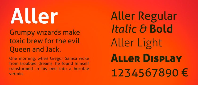
A non-system font like Aller allows you to put flourishes to work using weight, as well. The result is a font that somehow conveys familiarity. Perhaps it is the weight of the capitals. Perhaps it is curves of the italics. Either way, Aller is a great alternative to a system font.

Font: Aller
Source: Dalton Maag Ltd via Font Squirrel
Family: Sans Serif
Feel: Accessible and familiar with a hint of fonts used for literature
Works Best For: Accessible copy options for personal websites or business websites with a social or colloquial tone
2. Empower Your Inner Coder for Clarity
The famed open source OS system also offers a font family.
As with the OS, the font conveys messages clearly and is wildly versatile.
Family: Ubuntu
Source: Dalton Maag Ltd via Google Fonts
Family: Ubuntu
Feel: The attitude is reliable and educated, but laid back and easy to read
Works Best For: People who want clarity and character in both desktop and mobile mediums
3. Find Versatility in Simplicity
You might think that a system font is your “go to” when you want something simple. However, many non-system fonts offer more variety of simplicity.
I know, I know, that’s a head-scratching statement. But think about it: haven’t you felt cloistered by Helvetica before? Conversely, Palatino Linotype feels too conversational or flourish-y.
That’s where fonts like Gotham come into play. They are easy to read without sacrificing style or simplicity. They also allow writers like me to sneak in Batman gifs.

Font: Gotham
Source: Tobias Frere-Jones via Gothamfree.com
Family: Sans Serif
Feel: Buttoned up with a little flair; adds little to no bias on copy for reader
Works Best For: Design oriented lifestyle brands and marketing agencies
4. Easily Translate Web Pages With Non-System Fonts
Agonizing over a font can seem mundane. But like Mary Poppins, magic doesn’t always come with magic wands and a bunch of dragons.
The Indian Type Foundry produced the font “Poppins” with users who want more out of their web-safe font choices.
Essentially, the font translates very easily and very well which is not always the case with many system fonts.
Font: Poppins
Source: Indian Type Foundry (ITF) via Google Fonts
Family: Sans Serif
Feel: effortless and straightforward. The monolinear design allows for increased readability
Works Best For: Sites that want to be easily translated and formatted
5. Get Angular
Sometimes, system fonts don’t have enough or the right personality for your project.
“Sturdy typography” is a common trend no one seems to be talking about. While it is documented that Serif font family types are popular this year, no one seems to talk about the differences between all of the Serifs.

Take Anivers for instance: a very angular, svelt typeface. It is sparing with its use of flourishes and is not very curved. This lends the copy in Anivers a more academic or futuristic feel without being over the top.
Font: Anivers
Source: Exljbris via Font Squirrel
Family: Sans Serif
Feel: Rigid, but still flexible; Allows for creativity within structural boundaries
Works Best For: Personal websites
6. Channel Your Inner Disney
People who aren’t rabid Sleeping Beauty fans might not recognize this reference.

“Merriweather” is one of the three fairies in the fable, but it’s also the name of a non-system font option. Much like its fairytale counterpart, the font has an air of whimsy about it without feeling irreverent.
It utilizes classic literature font stylings while incorporating the more streamlined monolinear shapes of modern fonts.
The result: a readable font that encourages reader interpretation.
Font: Merriweather
Source: Sorkin Type via Google Fonts
Family: Merriweather
Feel: Storybook-esque without sacrificing readability
Works Best For: Personal websites and long-form editorial platforms
7. Let Loose Your Inner Handwriting
Don’t be afraid to go for relatability if your brand or voice calls for it.
Fonts like Indie Flower allow for websites to employ realistic handwriting fonts without sacrificing readability.
Font: Indie Flower
Source: Kimberly Geswain via Google Fonts
Family: Indie Flower
Feel: Very conversational and familiar
Works Best For: Personal websites, children related businesses, and advertising
8. Embrace Multiple Mediums
We briefly touched on how some fonts are multitaskers in that they work on multiple platforms. Your website won’t just be viewed on a desktop PC or laptop computer.

Furthermore, you might want to evoke the traditions of print media on your website. To do that, consider a non-system font like Arvo. The weight of it conjures memories of a person’s favorite book while still being extremely web-safe.
Font: Arvo
Source: Anton Koovit via Google Fonts
Family: Slab-serif
Feel: Traditionalist yet modern; allows for easy reading and grandeur
Works Best For: Companies with print and online media

9. Whitespace Can Be Your Friend
What you might notice about many system fonts is their rigidity of form. This impacts the way readers interact with the font and the message conveyed by the copy.
Arial is very square. Calibri is a bit too diminutive. Comic Sans is too light-hearted. What is a website designer to do?
Many find that what they want is a non-system font that incorporates design mentality. What does this mean for we regular folks?
Using whitespace and negative space for impact.
Montserrat is a classic example of how whitespace in a font can totally change the tone of the copy. As such, it is no surprise that more than 4 million websites use this non-system font.
Font: Montserrat
Source: Julieta Ulanovsky via Google Fonts
Family: Montserrat
Feel: Similar to Gotham, but a little more compact
Works Best For: Companies with modern voice and branding
10. Be Bold Without CTRL+B
As mentioned earlier, formatting can only take your website so far. Not everything can be bold, italicized, or underlined.
Bulleted lists, if over-used, lose their meaning just like block quotes.
The best way you can ensure that your formatting techniques will carry their weight is to give them a solid foundation. Something like this next font can help you with numbers 2, 4, 9, and 10 on this list of 12 best ways to use non-system fonts on a website.

Font: Roboto Slab
Source: Christian Robertson via Google Fonts
Family: Roboto Slab
Feel: Weighted without feeling heavy; evokes traditional fonts with design of web fonts
Works Best For: Editorial platforms and personal websites
11. Newsflash: Cursive Can Be Totally Legible
Though not used much today, cursive handwriting used to be the way of the world.
It was a way to showcase your education and personality and it is still very much that.

A cursive font allows you to convey emotional messages without even really using emotional language.
Many people associate cursive with their grandparents or their favorite teacher, so the font type lends itself to gifts and hand-made crafts.
Font: Dancing Script OT
Source: Impallari Type via Font Squirrel
Family: Hybrid of Murray Hill and Mistral
Feel: Lively and bouncy while still being incredibly readable
Works Best For: Personal websites or e-commerce sites with handcrafted products
12. Non-System Fonts Can Help Readers Negotiate Difficult Content
If you have ever read over old essays in Times New Roman, you might have found yourself snoozing a bit. We have become so overloaded with specific fonts (usually system fonts) that our brains may not recognize the words and meaning of the copy.
Utilizing something just as web-safe without it being a system font is a great “hack” for those who want to stay box adjacent.

Font: PT Sans
Source: ParaType via Google Fonts
Family: Sans Serif
Feel: Classic and easy with no frills; allows for total absorption of copy with no distractions
Works Best For: Anyone and everyone who wants to use it
Don’t Be Afraid to Experiment
Designing the perfect website is an on-going process. You may find a font or logo that works now but requires updating in a year or two (or even less than that).
The good news is that these options are always available along with many others to suit your needs.


Comments (0)
Most Recent