In response to user feedback, Google issued an official statement about the new looks of its desktop search result.
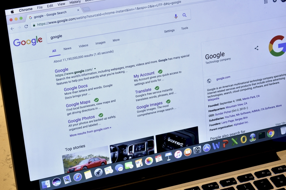
Earlier in the month, Google made one of the most significant changes to how it displays search results on desktop. And the changes took effect over the previous week.
These include moving the URL in organic snippets and changing its color. However, the most noticeable change may be the inclusion of favicon next to organic search results and plain black “Ad” label next to paid results.
Google argued that the more prominent “Ad” label was an attempt to mirror what already exists on mobile search.
But, users were far from impressed. Critics pointed out that the visual overhaul made it challenging to distinguish between organic results and paid search.
It turns out Google was listening, and the search engine company has responded to the feedback.
Danny Sullivan announced in a tweet:
“Last week, we updated the look of Search on desktop to mirror what’s been on mobile for months. We’ve heard your feedback about the update. We always want to make Search better, so we’re going to experiment with new placements for favicons….”
Here’s what we know so far.
Google’s Experiment With the Desktop Search Result Design
The tech company says it would start experimenting with the existence and placement of favicons in the desktop search result. Although it began on Friday last week, the experiment should extend over the coming weeks.
“Our experimenting will begin today,” says Sullivan. “Over the coming weeks, while we test, some might not see favicons while some might see them in different placements as we look to bring a modern look to the desktop.”
Google also released a formal statement to explain why it made the initial design change. It reads:
“We’re dedicated to improving the desktop experience for Search, and as part of our efforts around this, we rolled out a new design last week, mirroring the design that we’ve had for many months on mobile. The design has been well received by users on mobile screens, as it helps people more quickly see where information is coming from, and they can see a prominent bolded ad label at the top.
Web publishers have also told us they like having their brand iconography on the search results page. While early tests for desktop were positive, we are always incorporating feedback from our users. We are experimenting with a change to the current desktop favicons, and will continue to iterate on the design over time.”
Shortly after the announcement, Google started experimenting with favicon removal.


Comments (0)
Most Recent